5 Important Things to Remember On a New Website
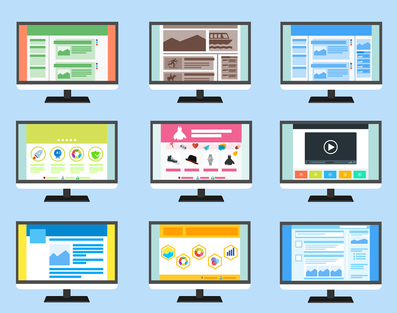
When it’s time to refresh your website, you’ll want a solid plan in place. Overhauling your site is major construction. A strategy will confirm that you’ve made improvements and implemented new features that will enhance the overall user experience. What your site needs depends on your business and what you need to compete in the new digital market.
Since the dawn of the internet (and technology for that matter) features and functions have continuously been upgraded. They slowly begin to replace outdated methods that made it harder for users to engage meaningfully with your content. Your business needs a website that operates in a way that conveys a strong message and puts your consumer first. With decades of experience in developing new sites, we’ve pulled from our expertise a list of a few essential things to remember for a new website.
Easy to Navigate Menu
Your navigation menu is critical to the success of your website. Customers who visit your site are looking for information that is important to their needs. Therefore, you need to create a navigation menu that is easy to operate. The harder it is for your end user to find the information they need, the faster they are going to leave your site. You can utilize your Google Analytics to help with this part of the process. Filter through and see what pages receive the most traffic. Try to construct your new sitemap to feature the pages that receive the most attention prominently. Putting this in front of your customer reduces the bounce rate and improves the conversation.
Mobile Responsiveness
It’s no longer an option to choose to integrate your web design to include mobile response. Now more than ever, consumers are utilizing their smartphones and tablets to access information. What does this mean for your new website? That you need to design your site with mobile in mind. Previously, you would construct a desktop and integrate features to read and interact well with mobile. Today you need to start these considerations at the onset and confirm that your new website is responsive across all devices. Where can you make the biggest impact on your mobile design? The navigation menu. We’ve already told you how important it is, but developers can fall short at the hurdle by not incorporating the “hamburger” menu. If you’re not familiar with the term, the hamburger menu is the three bars on a mobile design in the top right or left. It neatly organizes your pages without cluttering the critical information.
CTAs For Internal Link Building
Finding quality leads is possible with link building. Strategically placed Calls to Action (CTA) help users find the information they need quickly. CTAs are attached to links on the website. Their purpose is to connect your audience to a relative message from your company. It could be how to get in touch with you and lead them to the contact page or more information about products/services and point to the product/service page or blog post. What’s most important here is the placement of the CTAs and ensuring they are relevant. At the end of your service page, always engage your customer to get in touch when it’s needed. If you have blog posts, never post one without linking back to more information on the website.
Reviews and Testimonials
It’s impossible to find a business online that doesn’t have a review. Either the website will host the review process, or you will find it through Google. Testimonials and reviews should be part of your inbound strategy and implemented on your new site. In fact, a whopping 90% of online shoppers, will read reviews before investing their time and money into a new business. Your online reviews are proof of credibility and allow consumers to make informed decisions. They can boost your SEO and help improve business practices. The truth is reviews and testimonials only work for you, so include them on your new site. It wouldn’t hurt to feature them on your homepage.
SEO Optimization
Ranking high on search results gets you in front of new customers. Using an SEO strategy is how you make that happen. Optimizing your website isn’t new. So, why are we talking about this for a new website design? Because you need to improve your strategy to mirror the best practices set forth by Google and other search engines. SEO changes often and the trajectory looks different moving forward. Now developers have to take into consideration mobile use and Google’s new indexing. Mobile interaction is leading the way for SEO’s major changes. Voice recognition software that allows users to ask complete questions means you need to include full sentences as part of your strategy. Previously, you could get away with fragments. An example would be “Nashville coffee shop.” Today, you’ll want your strategy to include the question “where’s the best place to get coffee?” Notice a difference? Yep. Consumers now expect the location to be implied. As you design your new website, include this in your SEO optimization strategy.
At Horton Group, we’ve been helping clients improve their website design for many years. Our team of developers is experienced in the best practices and most recent technology, so your site works for you. Learn more about enhancing your user experience. Contact us today.