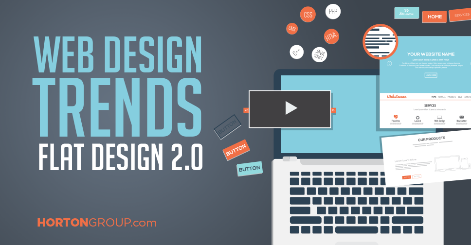
Web Design Trends: Flat Design 2.0

Getting ready to design your next website? Great! First, you will need to determine the type of design you want. Choose a design that is both aesthetically pleasing and user-friendly. Flat Design 2.0, one of the biggest trends in web design, does both beautifully. To understand why, you will need to know a little bit about its origins.
The Origins of Flat Design
Flat design became popular in 2012 after being introduced by Microsoft in 2011, when they released their Metro Design Language. The new style was described as “authentically digital.” It offered a way to explore the digital world without having to produce the appearance of physical objects.
Apple’s use of Flat Design provides a good look into the popularity of this design trend. The company was originally set on realism and was reluctant to make the transition to Flat Design, but did eventually make its website flat in 2013.
Flat Design does contain some usability issues though. For instance, because it removes underlined urls and button shapes, some users find it a struggle to know what is clickable and what isn’t. Recently, designers sought to correct this issue and found new ways to still be “authentically digital,” without compromising usability. Introducing: Flat Design 2.0 (also, called semi-flat or almost flat).
The Evolution to Flat Design 2.0
Flat Design 2.0 remains mostly flat, but features shadows, highlights and layers to add depth to the design. One great example of Flat Design 2.0 is Google’s Material Design. This language uses metaphors and principles from physics to help users make sense of a particular interface. Some distinctive elements of Flat Design 2.0 include:
- Long Shadows
- Bright Color Palettes
- Simply Typography
- Ghost Buttons
- Minimalism
How to Use Flat Design Principles Effectively
Flat design can be a great way to design your website, but you need to know how to use it effectively. Here are a few suggestions to ensure your next web design doesn’t miss the mark.
- Bold Colors. One of the signature elements of Flat Design is big bold colors. If you are looking for great colors for your website, this is an excellent place to start.
- Typography. Good typography is highly important in Flat Design. Some popular styles include uppercase lettering and white text over a background.
- Vector Illustrations. Flat colors are perfectly suited for vector illustrations. Use vector images in your design to accentuate the flat nature of your web design.
- Panoramic Background Photos. Though panoramic images aren’t intrinsically flat, they are widely used in flat design. In addition, they help to bring out flat overlaid images on the page.
- Subtle Background Patterns. One way you can get creative with flat design is to use subtle background patterns on the panels of your website. Make sure to make these details flat in themselves to not take away from the flat design of your website.
Ready for Your Next Web Design?
If you are ready to take on your next web design project, our team of professional web developers is here to help. Take a look at some of our previous web design projects or contact us now to learn more! 615.292.8642
{{cta(’61bacec3-8918-4607-9e8b-2c992a593af8′)}}