How to Design a Logo
Take a minute to Google all of the businesses that do what you do. You probably found a lot. With so many competitors, how are you going to stand out from the crowd? While there are a lot of components, one important way is through a unique, professionally designed logo.
In a world where a couple of clicks can build you a $40 logo, you may wonder why you need to spend a lot of time making a unique design. Why not just throw some text on a page and move on to what really matters?
Unfortunately, generic logo designs are just that—generic. Rather than stand out, they blend in.
A good logo can:
- Help people remember your brand
- Help customers connect with you emotionally
- Establish your leadership in the industry
- Be a critical part of internet marketing
So how do you design a good logo?
Find Your Why
Your logo should represent who you are as a company and why you do what you do. HubSpot, a marketing company, recommends that you “start with your story… Step outside of what your company does and convey why you do it. That ‘why’ is the root of your story.”
{{cta(‘38543a4b-b2bd-46ca-9d0e-66a7922b7e86’)}}
99designs, a design company, summarized it this way: “You want your logo to communicate your brand’s personality. And in order to do that, you first need to understand what your brand’s core personality is. Once you have a clear idea of what makes you unique and what your brand is all about, it will be much easier for you to make design choices that complement and complete that picture.”
A logo designed by Horton
Brainstorm
Jot down as many words and ideas related to your brand as you can. They don’t have to be good at this stage. Just think of ideas and refine them afterward. What represents you? What’s important to your target demographic? Look at what your competitors are doing with their logos.
99Designs gives several categories for logos:
- Classic: A simple, normal design
- Vintage/Retro: A nostalgic design
- Minimalist: Simple and modern
- Fun/Quirky: Our logo would fall under this category
- Handcrafted: Old-style
Avoid Clichés
Google SEO company logos and click images. Most of the logos will feature graph lines trending upward or magnifying glasses representing search engines. (Not a lot of purple elephants, surprisingly.)
This means that if you own an SEO company, you might want to avoid these two elements, or at least do something unique with them. Customers don’t remember generic logos. According to HubSpot, “You should absolutely avoid any popular clip-art artwork or generic symbols like a globe, star, or similar icons that people too easily identify from other places. These are easily forgotten at first glance.”
Logos can be a bit abstract. What do apples have to do with computers? What do shells have to do with gasoline? Or for that matter, what do elephants have to do with marketing?
While I can’t answer the first two questions, our company is named after our founder, Ned Horton, and the logo was inspired by the book Horton Hears a Who by Dr. Seuss.
Be Minimalist
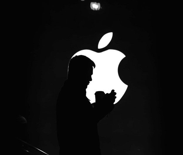
Logos were minimalist even before it became trendy. If you Google popular logos, you’ll find that most of them are very simple. You could draw the Apple, Nike, or Target logo in just a couple of seconds. Likewise, our elephant is only a couple of lines.
“Keep the shape simple,” HubSpot recommended. “If you can sketch the most symbolic components in seven seconds or less, you’re in good shape.”
Most famous logos are really simple; but on the other hand, the Starbucks mermaid is a bit more complex, as is the Wendy’s logo. Some of the NFL football teams have less minimalistic logo designs. Additionally, this logo our company designed is more complicated.
Overall, however, if you Google famous logos, you’ll find most of them are fairly simple. As an example, click here to see how Shell’s logo has grown simpler over time, from an accurate drawing of a shell to a more abstract one.
Simplicity doesn’t mean carelessness, however. A lot of thought goes into those simple logos.
Some Other Considerations
- Make sure your logo looks good against different colored backgrounds.
- Make sure your logo looks good at different sizes. If you have a website, your logo will need to look right even as a tiny favicon (the little icon in the tab).
- Avoid overused fonts in your logo.
- Consider the emotions your logo’s colors evoke. We associate different colors with different things.
- Make sure there’s nothing in your logo design that could be taken in the wrong way. People have dirty minds. For instance, people have pointed out how the Pepsi logo looks like an overweight man with his stomach showing. Try running your design by people to see if they notice anything unintentional.
Work With Us
Our team will help you tell your brand story through your logo. The experienced designers of our Nashville logo design company will make sure the look and feel of your logo is as perfect as possible. Whether you want to create a new logo or update an existing one, we’re the company for you.
{{cta(‘ff1a812c-4ec0-4726-82bd-b6396ec0f32e’)}}
{{cta(’50acfdae-ab57-47fe-98c8-3d26f356cfb8′)}}